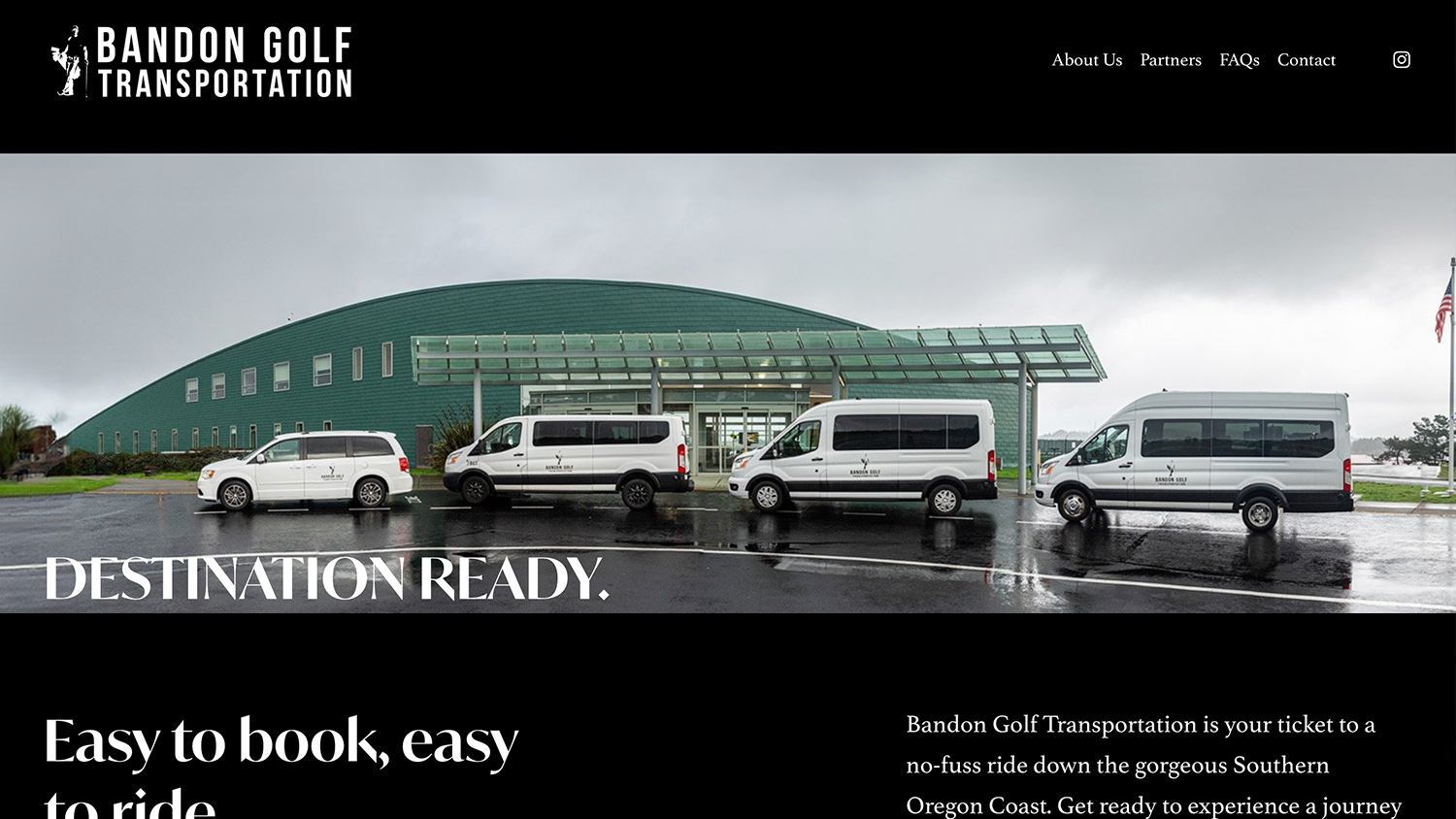
WEBSITE DESIGN & LAUNCH: Bandon Golf Transportation
I have had the privilege to work with the owner of Bandon Golf Transportation, who is not only a savvy businessman, but also…
I have had the privilege to work with the owner of Bandon Golf Transportation, who is not only a savvy businessman, but also…
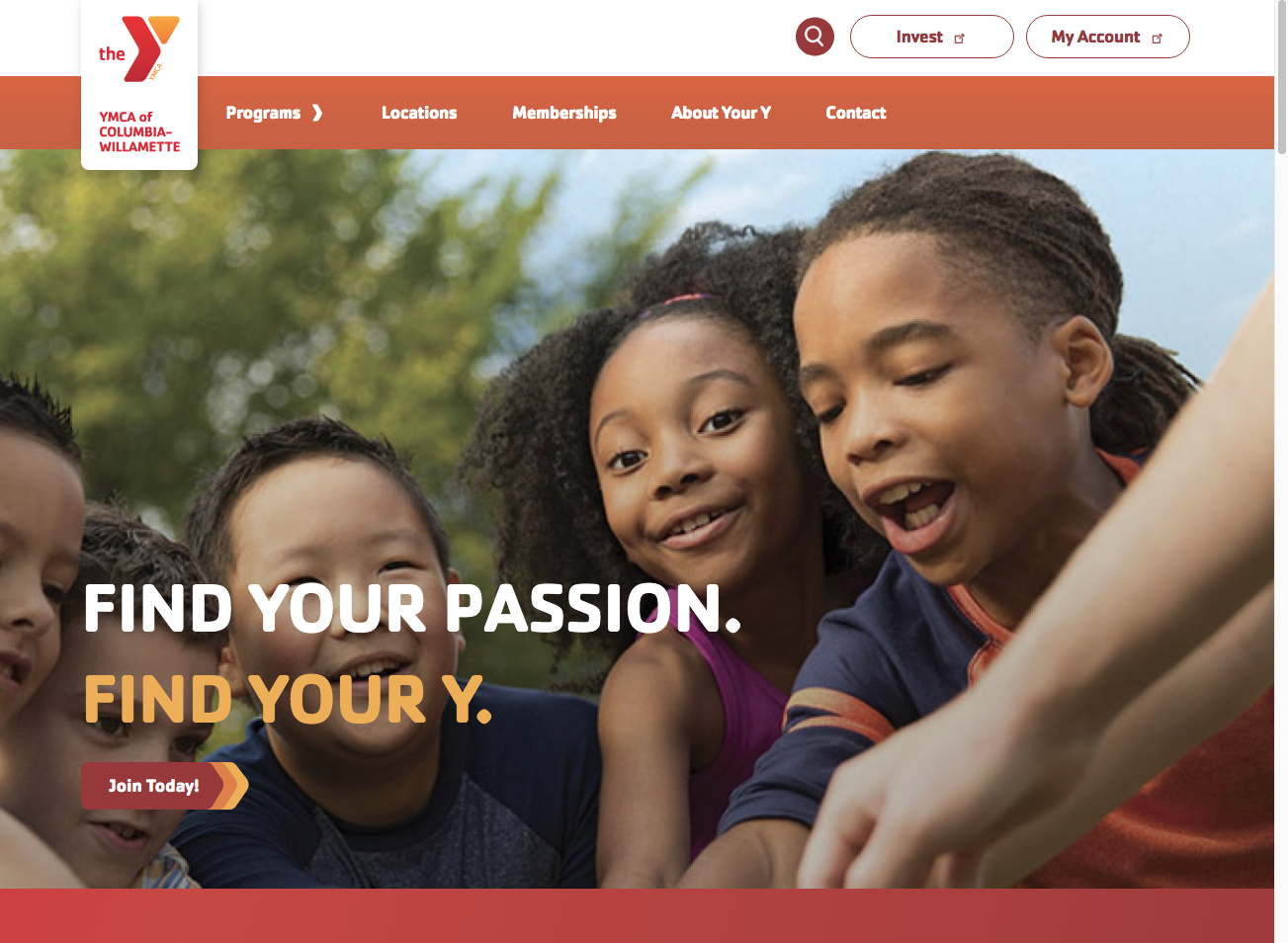
I began my job as Marketing Director at the YMCA of Columbia-Willamette in April of 2023. At that time, I took on creating…

Below are logos I helped design or compile assets for at Bandon Dunes From 2013 to 2021. The Bunker Bar (2014) McKees Pub…
In my nine-year tenure at Bandon Dunes Golf Resort, our brand system was working primarily from a group of shared folders. Before leaving…
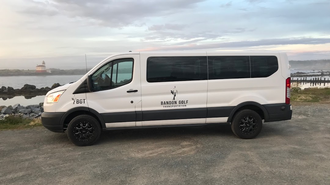
Bandon Golf Transportation is a small company in Bandon, OR, specializing in driving guests to and from BDGR. The owner/operator Gregg McCall is…
Six years in the making, the idea for the website kept me awake, tossing and turning for months and months. I must have…